Understanding LinkMap Visualizations
The LinkMap visualization is your window into understanding how your website's pages connect and interact. This guide will help you interpret and use the visual elements effectively.
Understanding the Visualization Map
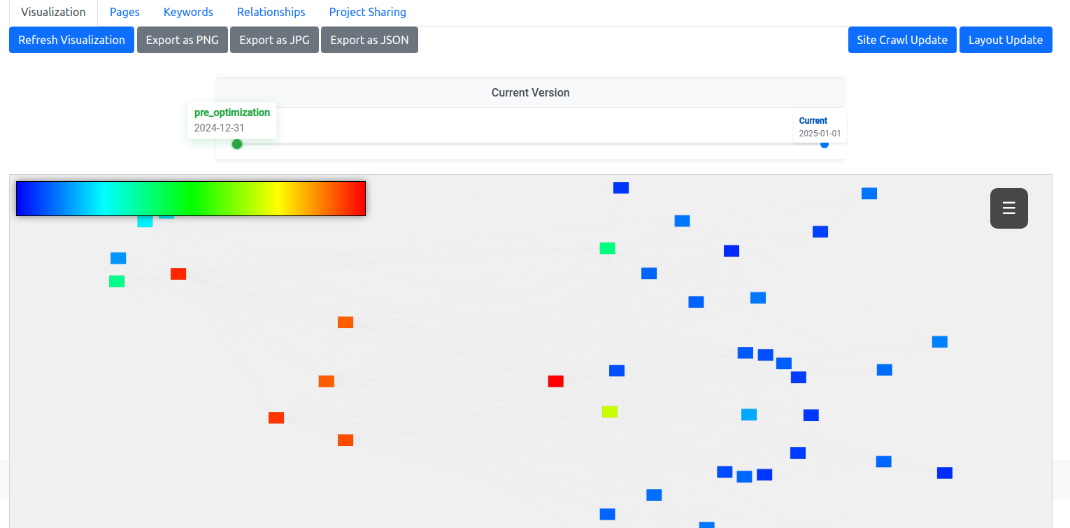
Your website's pages are represented as rectangular nodes in an interactive network graph. Each node shows the page's title and contains vital information about that page's role in your site structure. The connecting lines between nodes represent internal links between pages.
Color-Coded Authority
Node colors indicate each page's relative authority (PageRank value) within your site structure:
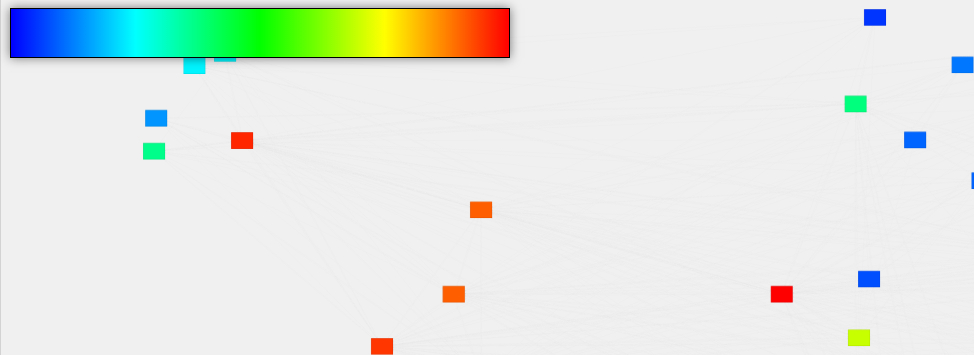
The color legend is always visible in the top-left corner of your visualization. For users who need enhanced visual accessibility, click the legend to toggle between standard and colorblind-friendly color schemes. The colorblind-friendly option uses a specially designed Viridis color palette that maintains clear visual distinction across its range.
Understanding Node Appearance
Nodes provide several visual cues about your pages:
- Size and Text: Nodes with bigger text represent pages higher in your site hierarchy
- Border Style: Solid borders indicate existing pages, while dashed borders show planned pages that haven't been created yet
- Text Color: Automatically adjusts between black and white based on the node's background color for optimal readability
Interacting with the Visualization
The Heads-Up Display (HUD)
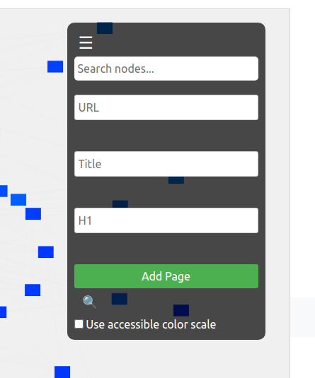
The HUD overlay in the top-right corner provides essential tools:

- Search: Quickly find pages by typing any part of their URL, title, or H1
- Page Management: Add new pages directly from the visualization interface
- Fullscreen Toggle: Expand the visualization for detailed analysis
- Accessibility Toggle: Switch between color schemes
Node Information
Click any node to open a detailed information panel showing:
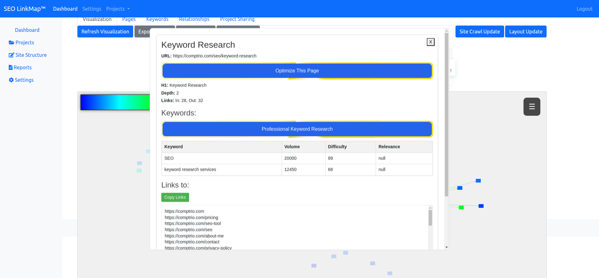
- Page title, URL, and H1
- Depth level in site hierarchy
- Number of inbound and outbound links
- Associated keywords and their metrics
- Options to optimize the page or conduct professional keyword research
Relationship Visualization
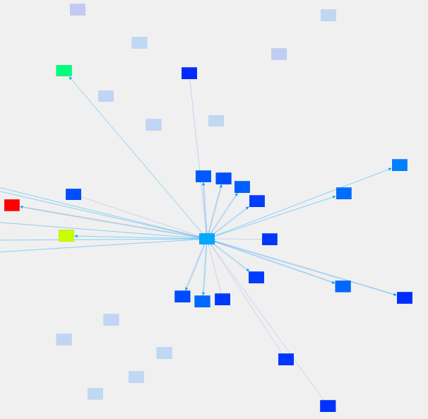
Hovering over a node highlights its connections:
- Outbound links appear as thick lines, colored to match the source node
- Inbound links appear as thinner lines
- Unconnected nodes fade to indicate potential linking opportunities
For more detailed interaction information, check out our Interaction Guide.
Timeline Features
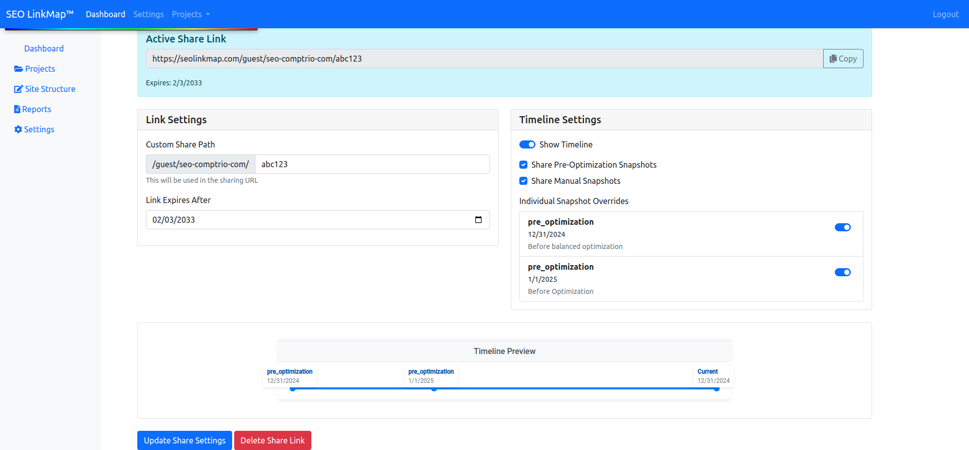
The timeline at the bottom of your visualization allows you to:

- View historical snapshots of your site structure
- Compare pre-optimization and post-optimization states
- Track structural changes over time
Learn more about sharing these visual insights with clients in our Project Sharing Guide.
Export Options
Capture your visualization for presentations or documentation using the export buttons above the graph:
- PNG for high-quality images
- JPG for smaller file sizes
- JSON for data backup and analysis

For step-by-step export instructions, visit our Export Options Guide.
Pro Tip
Use the fullscreen mode (🔍 icon in the HUD) when analyzing large sites or preparing client presentations. This gives you maximum visibility of your site structure and makes relationship patterns easier to identify.
