Site Structure Guide
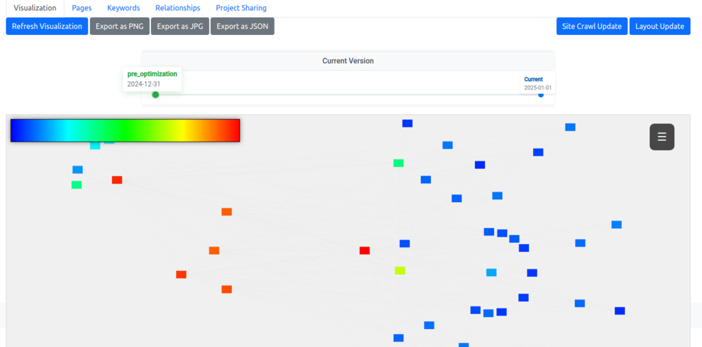
The visualization draws every crawled page as a node and every internal link as a line, with the homepage at the center and each page placed by how many clicks it sits from it. Node color is the metric you choose, scored against the strongest page on your own site. The map is the same whether you manage an agency or one site of your own.
Reading The Map
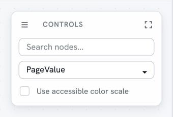
Color carries the metric selected in the HUD, and the HUD holds dozens of them. They come from three sources, our crawl, Google Search Console and Google Analytics 4, plus combined metrics built from more than one, such as PageValue, impressions, clicks, average position and more. Every metric is scored against the best page on your site, so the strongest node is always the full color and the rest are shaded relative to it.
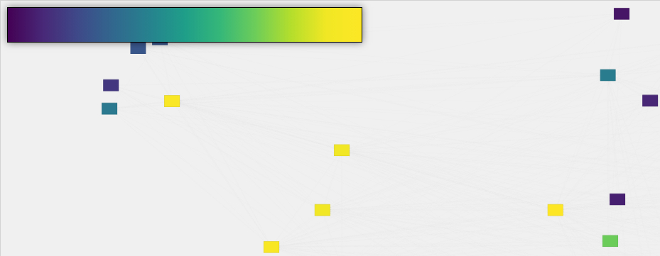
The default scale runs from blue at the bottom to red at the top. The accessible toggle in the HUD swaps it for a color-blind-safe scale that runs purple to yellow. Lines between nodes are internal links: solid for links that exist, dashed for links you have planned but not yet built.
Page Depth
Page depth is how many clicks it takes to reach a page from the homepage. On the map that is distance from the central node: pages one click away sit beside the homepage, and each further ring out is one more hop. A page you meant to be two clicks deep that sits at the edge of the map is a problem you can see before you measure it.
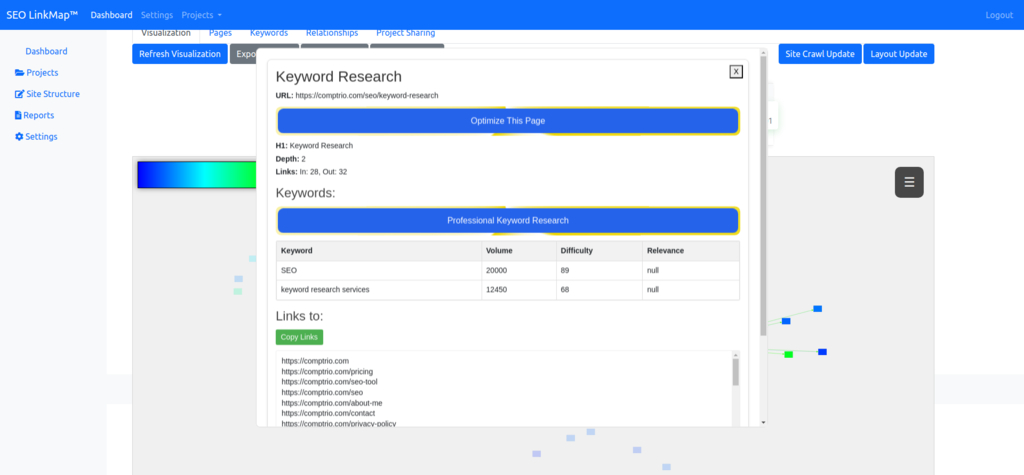
Click any node to open its panel. It shows the page's depth and link counts, the audit issues on it, the SEO actions logged against it, its keywords and its backlinks, and an "Unknown to Google" badge when Search Console has never reported it. The analysis tools guide covers the rest of the panel.
Content Clusters
Pages that link to each other pull together on the map, so a topic you have covered well appears as a cluster. A cluster joined to the rest of the site by only a line or two is topical authority that neither users nor search engines can easily reach.
Use the relationship management tools to add the links that tie a cluster to the pages that should feed it.
Authority Distribution
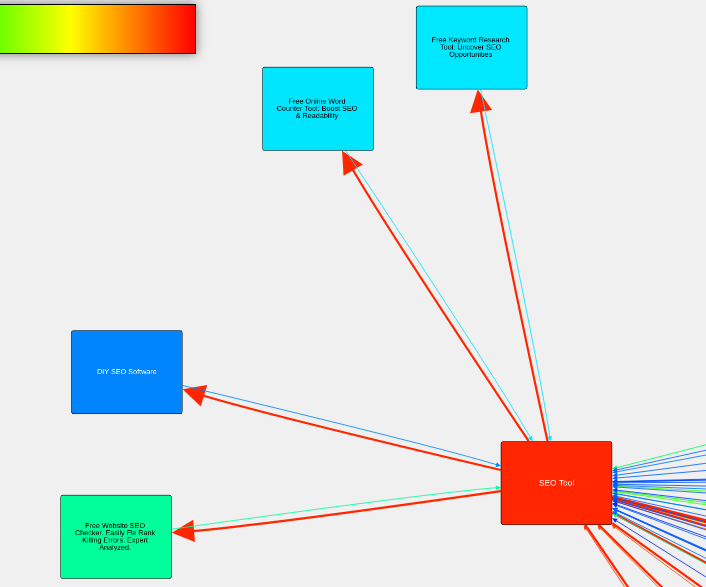
PageValue flows through your site along internal links, and the color of each node shows how much of it arrives there. The lines show where it is flowing. A pale node with few lines into it is a page the rest of the site is not supporting.
For a plan built around moving authority to the pages that need it, use the authority-focused optimization strategy.
Spotting Structural Problems
Three problems show up on the map before they show up in rankings. A dead end is a node with no lines leaving it. Unexpected depth is a page sitting further from the center than you intended. Weak internal linking is an isolated node, or a whole cluster, with few lines into it.
Fix them with the page management tools by adding or changing the page's links.
Planning New Pages
Add a page to the map before you write it, and draw its links as planned. The dashed lines show where it will sit, which cluster it joins and which pages it will feed, so the internal linking is decided before the content is. The timeline below the map keeps a dated snapshot of the structure each time it changes, so you can step back to see what the site looked like before a round of work.
The best practices guide covers how to plan a structure that stays balanced as the site grows.

For a plan of targeted changes to the structure you have, pick one of the optimization strategies.
What Does the Math Say
About Your Site?
Finding out is free and takes minutes.