Understanding the LinkMap™ Visualization Interface
The LinkMap™ visualization interface provides an interactive view of your website's structure. Each page is represented as a node, with connections showing how pages link to each other. This guide will help you understand and navigate the visualization effectively. You may want to learn how to incorporate this tool into your SEO workflow.
Core Components
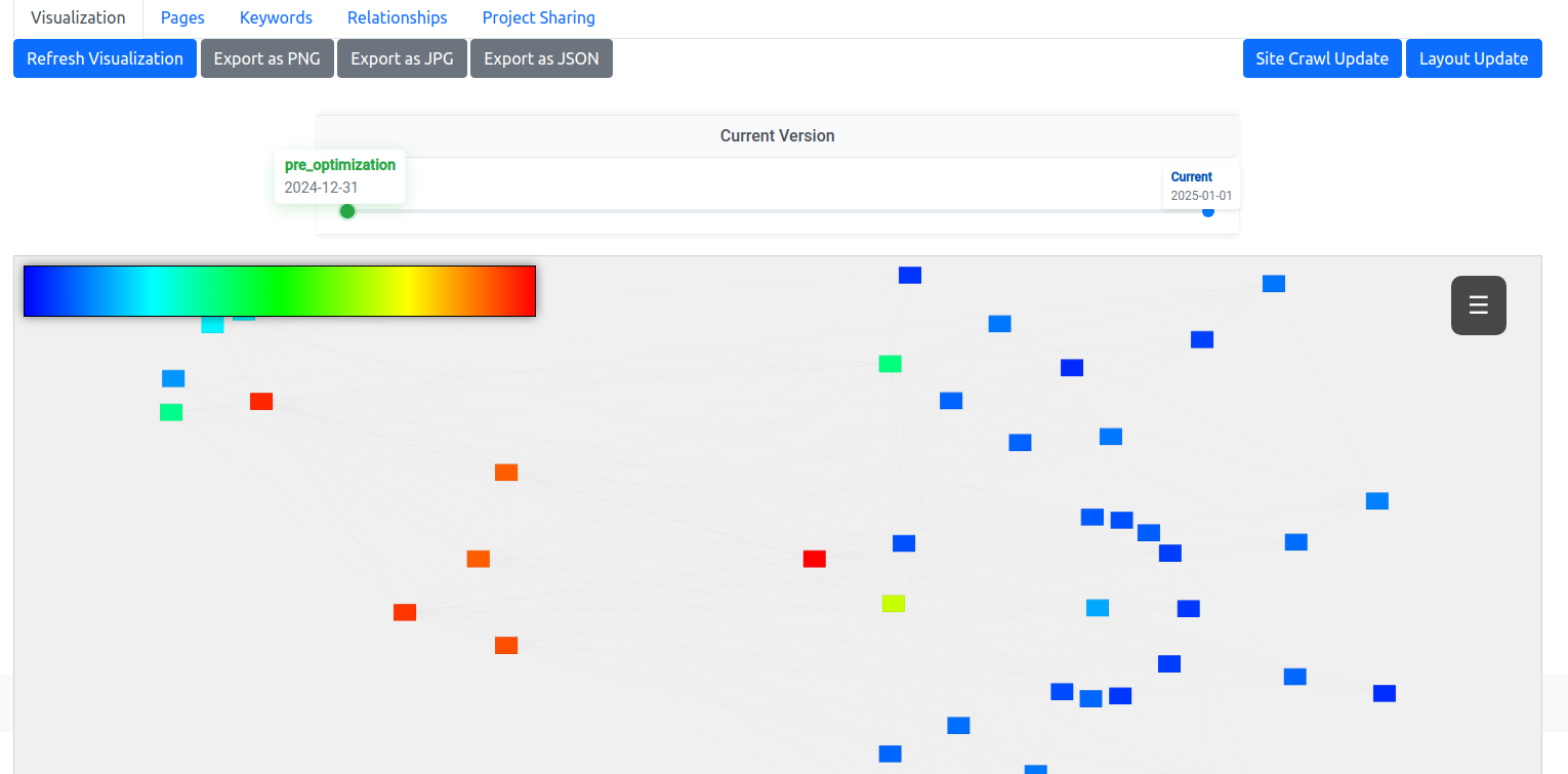
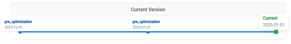
Timeline Navigation
At the top of the visualization, you'll find the timeline. This powerful feature tracks changes to your site structure over time and compares pre-optimization and current states. You can view snapshots from different optimization stages and share these with clients using a shareable, read-only, expiring link.
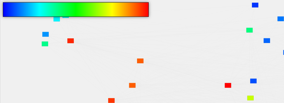
Color Scale Legend
The color scale in the top-left corner indicates page authority (PageRank) within your site. Pages are colored from low (blue) to high (red) authority, or you can switch to our accessibility-optimized scale for better visibility and printing.
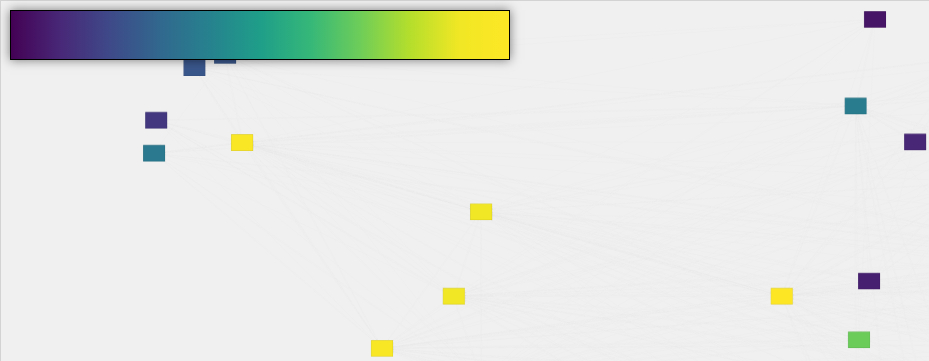
Pro Tip
Toggle between color scales by clicking the legend or using the accessibility switch in the control panel. The accessibility-optimized color scale is designed for colorblind users and produces clearer black-and-white prints.
Interactive Controls
The control panel provides several tools for working with your visualization. Search quickly finds specific pages within your site structure by title, h1, or url. Add Page creates new pages directly from the visualization. The Fullscreen Toggle expands the visualization for detailed analysis, while the Color Scale Toggle switches between standard and accessibility color modes.
Node Interaction
Each node in the visualization represents a page on your site. The lines connecting them are links. Click a node to view page details and optimization options. Hover over a node to highlight its connections. Click the left edge of a node to create new connections, then click another node to add the link.
Understanding Node Colors
Node colors reflect the relative authority (PageRank) of each page within your site. This internal authority calculation helps identify which pages could benefit most from optimization efforts.
It is perfectly normal, even expected, that the pages shown will span the color range. This is comparing your own pages to your own pages. This value is not from Google and does not compare your pages to any other pages on the internet.
Connection Lines
Lines between nodes show how pages are connected. Solid lines represent existing links between pages, while dashed lines show planned or suggested connections. Line color indicates the value of the link being passed.
Working with the Visualization
Navigation
Navigate the visualization by clicking and dragging the background to pan around your site structure. Use your mouse wheel or pinch gesture to zoom in and out for different detail levels. Click the Refresh Visualization button to reset the view.
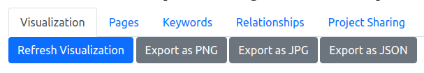
Export Options
Share or save your visualization using the export buttons. PNG format works best for presentations and documentation. JPG is ideal for email and smaller file sizes. JSON exports data for technical analysis.