SEO Performance Correlation Workflow
The metric dropdown recolors every node on the map, so you can look at your site's structure and its numbers in the same picture. Twenty metrics exist; the ones you see are the ones your connected integrations can fill.
Choosing a Metric
The selector sits in the HUD in the top-right corner of the map, under the word Controls, with the search box above it and the color toggle below. The hamburger button beside the title collapses the HUD when it is covering something you want to see.
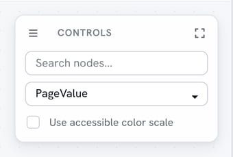
Pick a metric and the nodes recolor immediately, on a blue-to-red or dark-to-light scale depending on which color scale you are using.
Which Metrics Are Available
PageValue is always there, because it is calculated from the link structure we already crawled. Everything else arrives with an integration: Search Console adds impressions, clicks, average position, best position and an indexing gap, and Analytics adds pageviews, active users, scrolling users, engagement rate, bounce rate and session duration.
Internal links in and links out come from the crawl. The rest are composites that combine several of the above into one number, including Engagement Score, Search Performance, Visibility, User Interest, Overall Performance and Content Effectiveness.
Three metrics are labelled "inverted" in the dropdown - average position, best position and bounce rate. For those, a smaller number is the better one, so the scale is flipped and good still reads as the same end of the color ramp.
Reading the Colors
Color clustering is the thing to look for first. A run of neighbouring pages in similar colors is a section of the site performing as a section, which is usually what a well-linked topic group looks like.

A hot node alone in a cool neighbourhood is the more interesting case. That page is doing well without much structural support around it, which makes it a candidate for content gap work or for more internal links pointing at its neighbours.
The reverse pattern matters too. A cool node in a hot cluster is a page your visitors and crawlers can reach easily and are not rewarding, which is a content question rather than a structural one.
Tracking Change Over Time
Switch metrics rather than staring at one. A section that looks strong on impressions and weak on clicks is a titles-and-descriptions problem; strong on clicks and weak on engagement is a landing-page problem.
Recrawl after you make changes and compare the same metric on the same map. That before-and-after is the part that survives a conversation with somebody who was not in the room when you decided.
Explaining It to a Client
Show the map twice, once colored by structure and once by traffic. Two pictures of the same site answer "why this page and not that one" faster than a spreadsheet does, and they do it without asking the client to trust a metric they have never heard of.
This fits alongside the rest of the workflows, and it is the one to run when somebody asks where the next hour of work should go.
What Does the Math Say
About Your Site?
Finding out is free and takes minutes.